YouTube's mobile app redesign drops the Subscriptions tab, angering longtime users
The new layout on Android and iOS moves subscriptions behind a swipe on the Home tab and gives Shorts and uploads the prime spots.
 By Clara Nguyen
Published · 2 min read
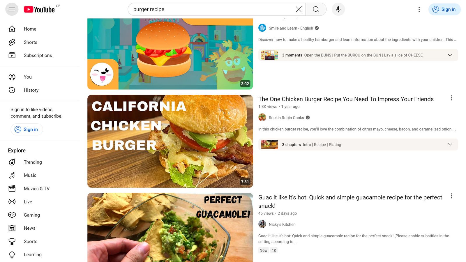
YouTube has begun pushing a redesigned mobile app to Android and iPhone users that eliminates the dedicated Subscriptions button from the bottom navigation bar. That button had been a fixture for close to a decade, and the change has drawn a wave of complaints from viewers who rely on it to find videos from channels they follow.
The company announced the overhaul last month. It began reaching large numbers of phones this week, apparently through a server-side switch rather than a downloadable app update. That means users may see the new layout without installing anything, and the timing can vary from one device to the next.
9to5Google described the redesign as the biggest change to YouTube's mobile app in roughly 10 years. The old five-button bar is gone. In its place is a layout built around Shorts and video creation, with the Shorts button and the Upload (+) button now sitting in the easiest spots for a thumb to reach.
Subscriptions still exist in the new app, but they no longer have their own tab. Users now reach them by swiping across the top of a reworked Home page. That page combines recommendations, a section labeled "Subs" and other feeds. Home also lets users set up a custom feed, which 9to5Google noted as one benefit of the update.
Android Authority reported that the update also removes the filters that let viewers narrow their subscriptions to Unwatched, Today or Live videos. In the outlet's assessment, users now land in a less organized feed driven more heavily by the algorithm, with large interaction icons.
9to5Google said that in practice, the app does not work very differently than before. The outlet added that the change disrupts years of habit and reorders which content gets priority.
The reaction has been heavily negative across Reddit threads and comment sections. Users called the new interface "Sloppy" and "disgusting." One called it "the worst UI that has ever been made by Google."
Most of the criticism targets the missing Subscriptions tab. Many users argue the app is now built around what YouTube wants them to watch rather than the channels they chose to follow. Some say years of tapping the same spot now open the wrong screen. Others point out that most people use YouTube to watch videos, not post them, so keeping an Upload button in the main bar while removing Subscriptions makes little sense to them.
Readers of 9to5Google voiced similar objections when Google first revealed the plan last month.
Android users have one shortcut. Long-pressing the YouTube app icon brings up a menu that includes a Subscriptions option, which opens the app directly to the subscriptions feed.
Neither report included a response from YouTube or Google to the criticism.
Sources
Clara Nguyen
Clara Nguyen follows semiconductors, computing hardware, and the industry developments behind modern devices. Her coverage connects chip announcements, manufacturing plans, and performance claims with the products they may influence. She focuses on clear explanations of technical terms and supply chain context, helping readers understand the significance of changes beneath the surface.
View all stories